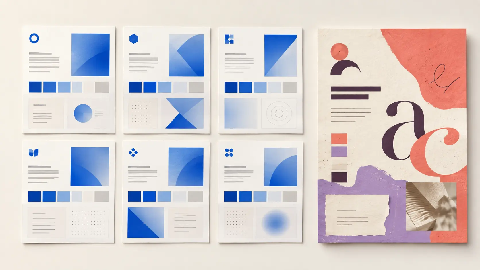
AI can generate a logo, colour palette, social post and complete brand kit in minutes. That speed is useful, but it creates a new problem: more brands can look professionally designed while becoming harder to tell apart.
The strongest visual identities in 2026 will not reject AI. They will use it deliberately while protecting the decisions that make a business recognizable: positioning, personality, typography, imagery, composition and a consistent point of view.
The quick answer: polished is not the same as memorable
| AI and templates provide quickly | A distinctive identity must establish |
|---|---|
| Professional-looking starting directions | A visual idea connected to the business |
| Familiar colours, symbols and layouts | Ownable choices that separate the brand |
| Fast logo and content variations | Rules that remain consistent across formats |
| Ready-made social and print assets | A recognizable voice, even without the logo |
| Efficient production | Relevance to a specific audience and context |
Why brand sameness is becoming a bigger problem
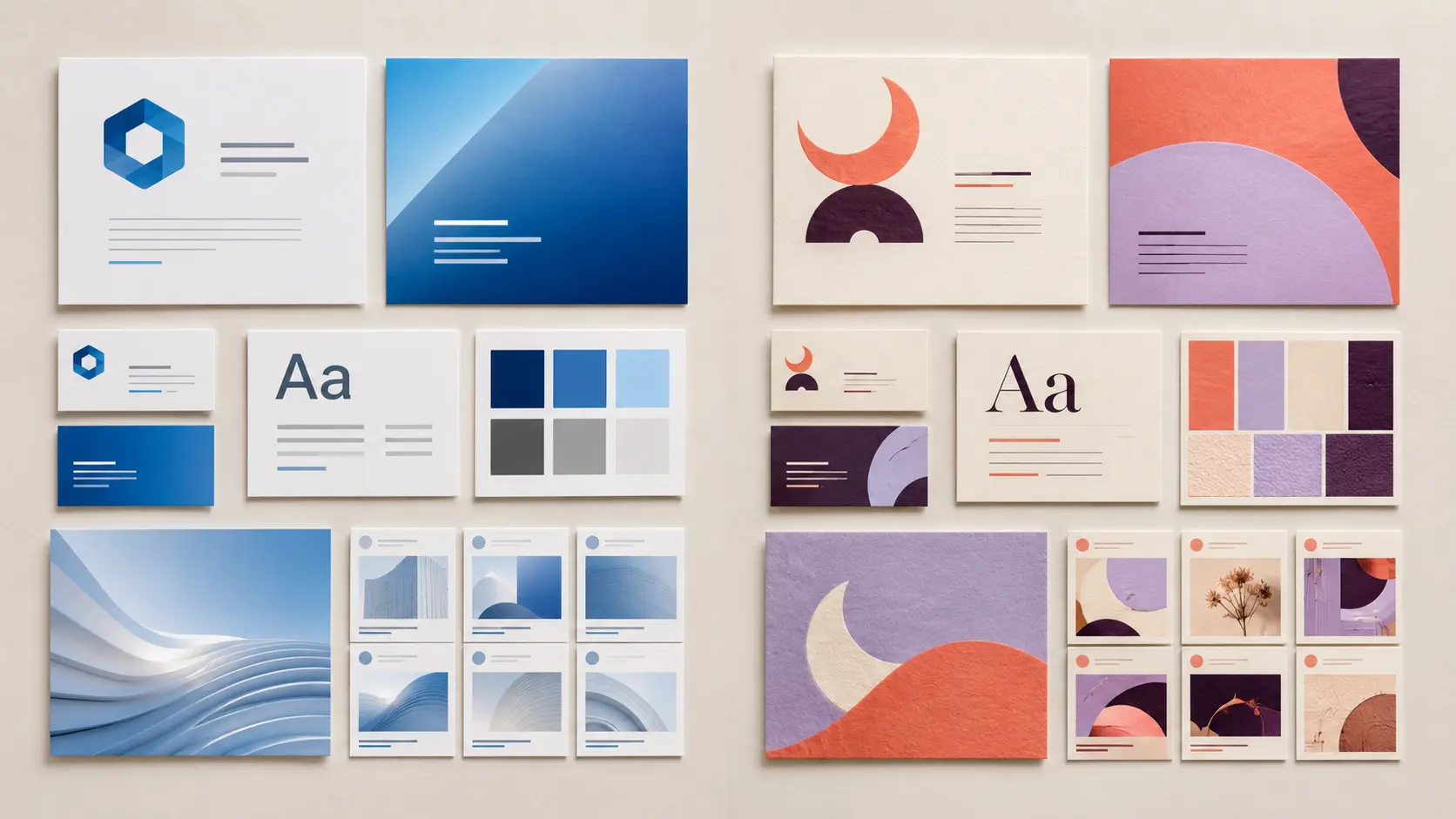
Businesses have always copied successful visual trends. AI and template libraries increase the speed and scale of that repetition across logos, websites, packaging and social content.
The creative response is already visible. Canva describes 2026 as the year of “Imperfect by Design,” based on its creator survey and design-search data. The company reports growing interest in tactile textures, candid layouts and creative work that feels personal rather than algorithmically perfect. Explore Canva’s 2026 design trends.
Adobe’s 2026 forecast reaches a similar conclusion from a different direction: brands are pursuing emotional connection, sensory visuals, playful experimentation and cultural authenticity while continuing to use AI. Read Adobe’s 2026 Creative Trends forecast.
Authenticity is not an effect to paste onto a template. The useful lesson is that a brand needs choices that feel intentional and specific instead of merely current.
Seven signs your brand identity looks generic
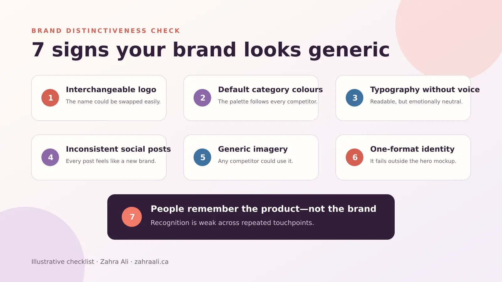
1. Your logo could belong to almost any company
A simple logo can be excellent, but simplicity is not anonymity. Hide the name: can someone describe what gives the mark its character, or is it only a polished geometric shape that could belong to any company?
2. Your colour palette follows the category automatically
Category colours can be useful, but relying on them automatically creates sameness. A stronger system defines primary, supporting and functional colour roles instead of collecting fashionable swatches.
3. Your typography has no voice
Many template-generated identities stop after choosing a clean sans-serif font. Build a typographic voice that fits the brand and remains usable across web, social, print and small screens.
4. Every social post feels like a different business
Templates can encourage constant visual switching. A brand system should allow variation while preserving consistent typography, spacing, colour roles, imagery and composition.
5. Your imagery is interchangeable
If every competitor could use the same stock photo or AI image, it contributes little to recognition. Define photography, illustration, texture, cropping and lighting rules so each new asset still feels connected.
6. The identity works in only one format
A logo can look impressive in a hero mockup and fail as a favicon, mobile header or one-colour print. A usable identity needs responsive versions, colour alternatives, spacing rules and tests at real sizes.
7. People remember the product but not the brand
If customers remember the product but not the name, colours, mark or visual character, the communication may be clear without being distinctive. Identify a few visual signals and repeat them consistently.
A visual identity is more than a logo
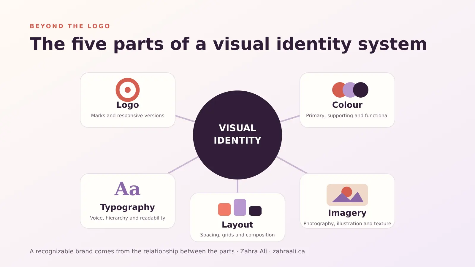
A logo is only one part of the visible system. A practical identity also defines colour, typography, imagery and layout; the relationship between those parts is what creates recognition.
Canva’s Brand Kit stores logos, colours, fonts, templates and other approved assets, while Adobe Express Brands can organize logos, fonts, colour roles and branded templates. These tools are helpful after the core decisions are made because they help teams apply a system consistently. See Canva Brand Kit guidance and Adobe Express brand guidance.
A real portfolio example: Samosa Express Visual Identity
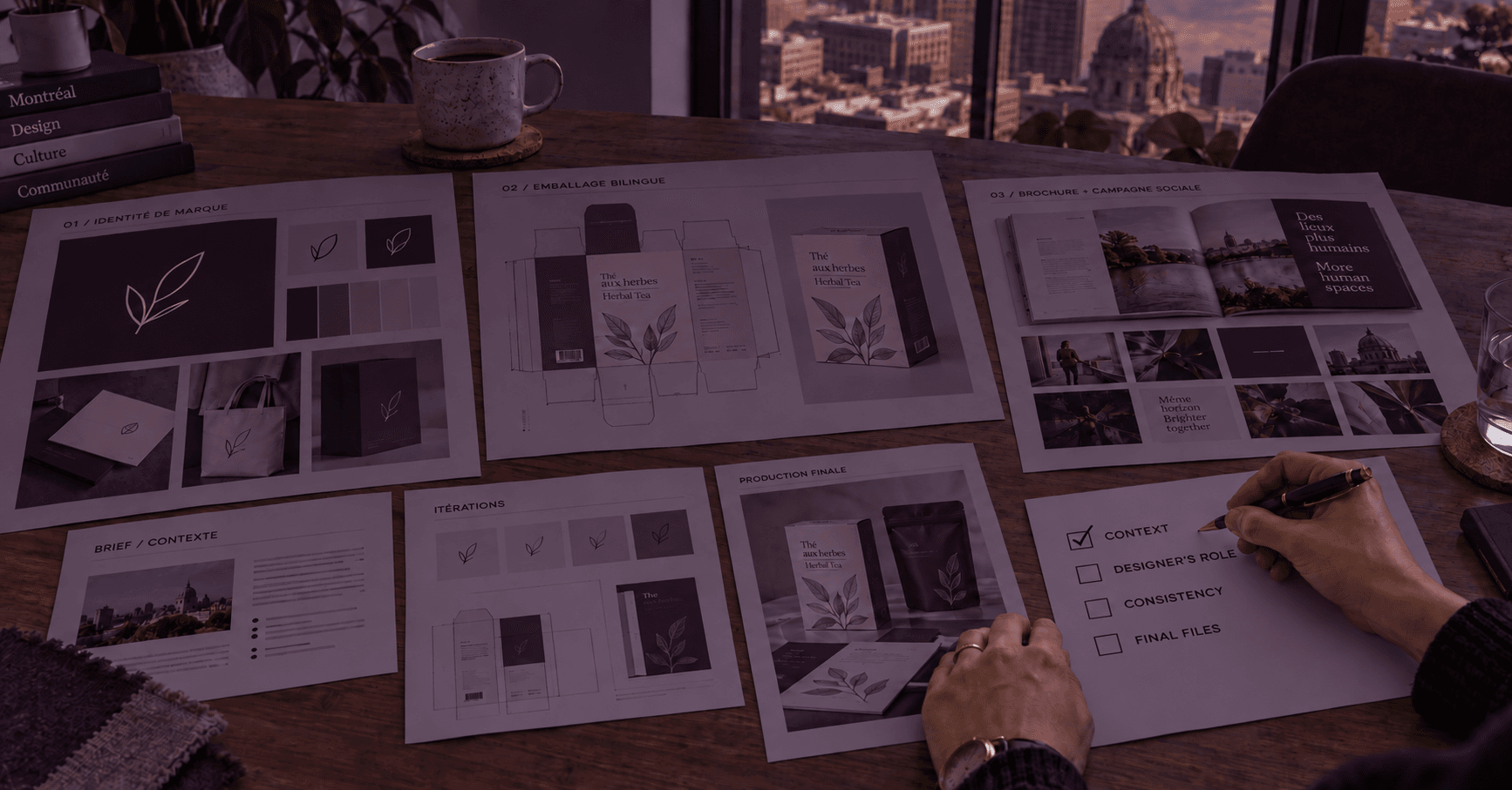
My Samosa Express Visual Identity project applies the identity to packaging instead of presenting only an isolated logo. View the project in my Branding portfolio.

The lesson is to test identity decisions where customers actually encounter them: packaging, a mobile interface, proposal, social campaign or storefront. Human design judgment connects the visual direction to competitors, hierarchy and real production constraints.
Take the five-minute brand distinctiveness test
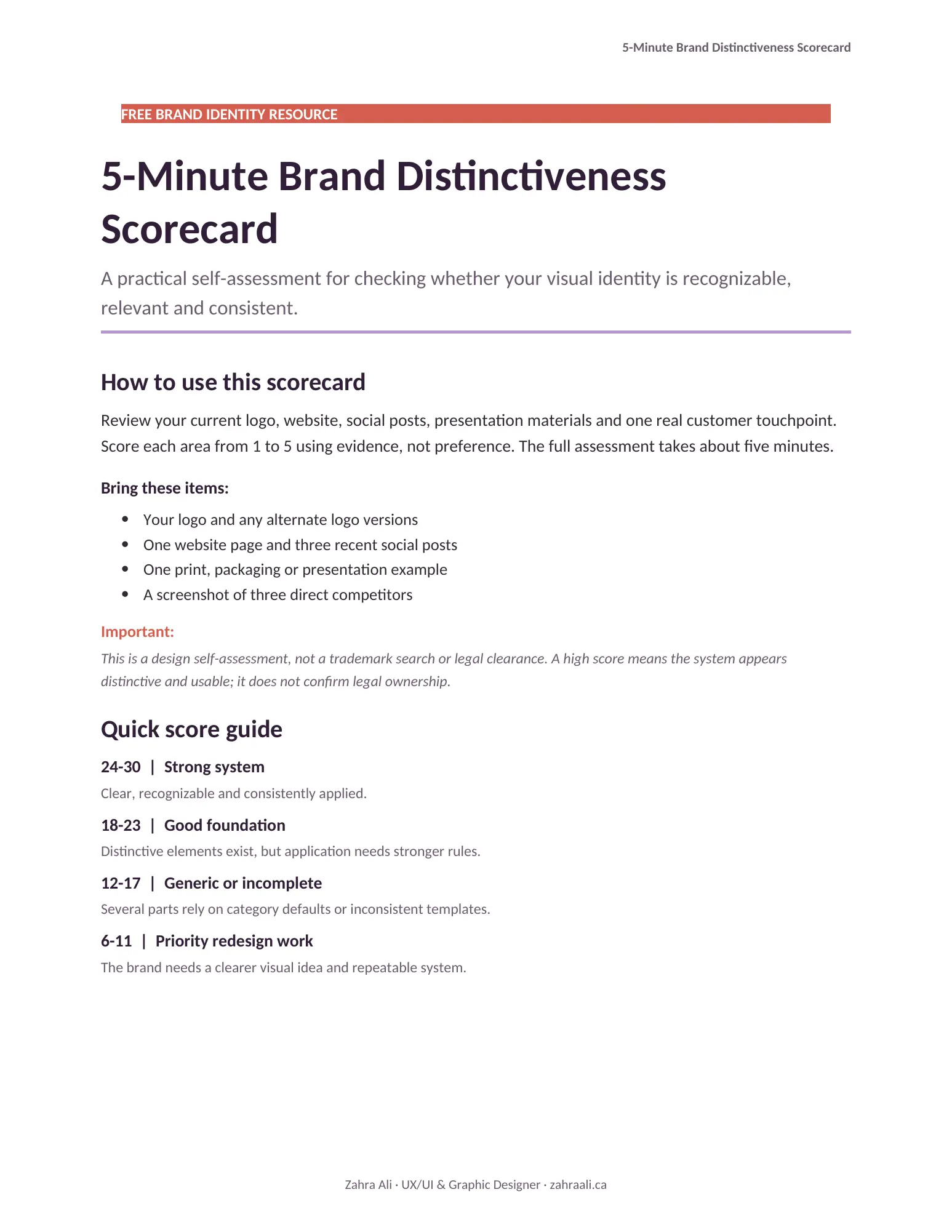
Use the free scorecard while reviewing your logo, website, social posts and one real customer touchpoint:
Score each area from one to five:
- Distinctiveness: Would the design still feel like your brand without the logo?
- Relevance: Do the visual choices fit the audience, offer and personality?
- Consistency: Do the website, social media, print and packaging feel connected?
- Flexibility: Does the system work across sizes, formats and light or dark backgrounds?
- Clarity: Are typography, hierarchy and colour roles easy to understand?
- Recognition: Can someone describe or recall the visual identity later?
A low score does not automatically mean the brand needs a complete redesign. The problem may be inconsistent templates, missing logo variations or weak application rules.
How to use AI without losing your visual identity
Give AI a system, not only a mood
“Modern and premium” is too broad. Provide approved colours, typography, composition rules, image references, audience context and examples of what the brand must avoid. The more specific the visual system, the less the tool needs to guess.
Use generation for exploration, not automatic approval
AI is valuable for producing many directions, testing compositions and adapting established assets. Review the results against the same criteria you would use for human work: relevance, originality, legibility, flexibility and consistency.
Check the competitive landscape
Before selecting a direction, compare it with direct competitors and category conventions. Similarity is not always visible when a logo is viewed alone. It becomes obvious when twenty competing identities appear together.
Build templates after the identity is defined
Templates are most valuable when they protect good decisions. Create a small set of flexible layouts with locked typography, colour roles, spacing and image treatment. This allows faster content production without turning every post into a new visual experiment.
The final verdict
AI has made attractive branding faster and more accessible. That is a real benefit. It has also raised the value of distinctiveness because professional polish is no longer rare.
The winning approach is not “AI versus designers.” It is AI for exploration and production, guided by human decisions about meaning, audience, originality and consistency. A distinctive identity does not need to be loud or complicated. It needs to be specific enough that people can recognize it as yours.
If your brand looks professional but still feels interchangeable, a focused Graphic Design consultation can identify whether you need a new identity, a stronger visual system or simply better rules for applying what you already have.