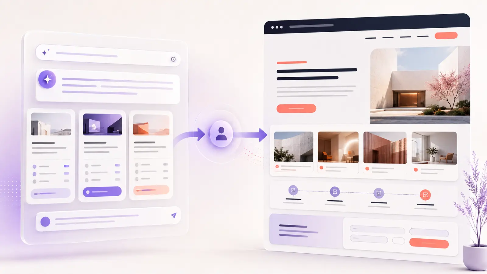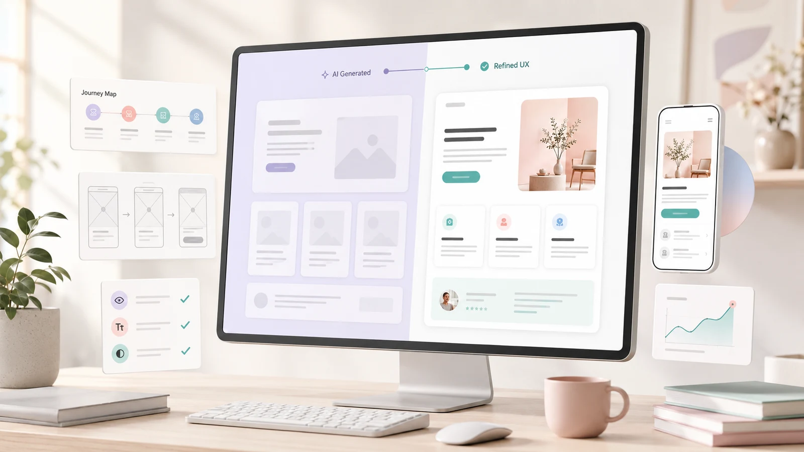

AI website builders can now produce attractive, responsive pages in minutes. Some can also generate interactions, content, code, sitemaps and complete multi-page websites. That speed is useful—but a polished first draft is not the same as a website that understands customers, answers their concerns and guides them toward the right decision.
The important question in 2026 is no longer, “Can AI make a website?” It can. The better question is: “Can this website help the right person understand the offer, trust the business and complete the next step without friction?”
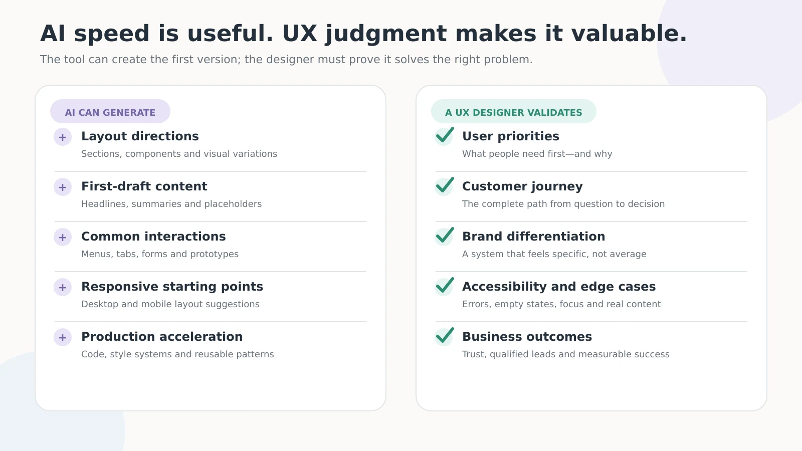
AI can create a first draft, but UX must validate it
| AI can generate quickly | UX design must still validate |
|---|---|
| Layouts, components and visual directions | What users need to see first |
| Draft headlines and section copy | Real questions, objections and decision criteria |
| Familiar menus, forms and interactions | The complete customer journey |
| Desktop and mobile starting points | Real usability across devices and assistive technology |
| Code, prototypes and publishable pages | Trust, accessibility, edge cases and business outcomes |
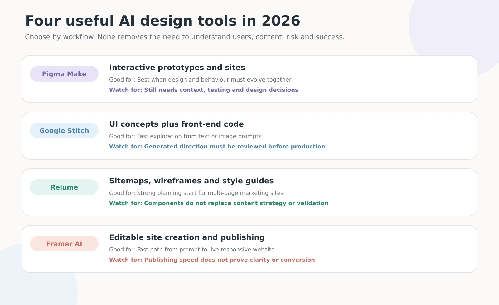
AI is becoming much better at producing interfaces. Figma Make can generate interactive websites and prototypes, Google Stitch can turn text or image prompts into UI designs and front-end code, and Relume can generate sitemaps, wireframes and style directions for marketing websites.
The limitation is context. An AI tool may know what a typical service website looks like, but it does not automatically know your customers, brand standards, sales process, legal constraints or the reasons people hesitate. Nielsen Norman Group describes this as a growing need for UX-context design: curating research, standards and user knowledge so AI-generated work is guided by more than an average pattern. Read the 2026 UX-context research.
Seven UX problems AI website builders still miss
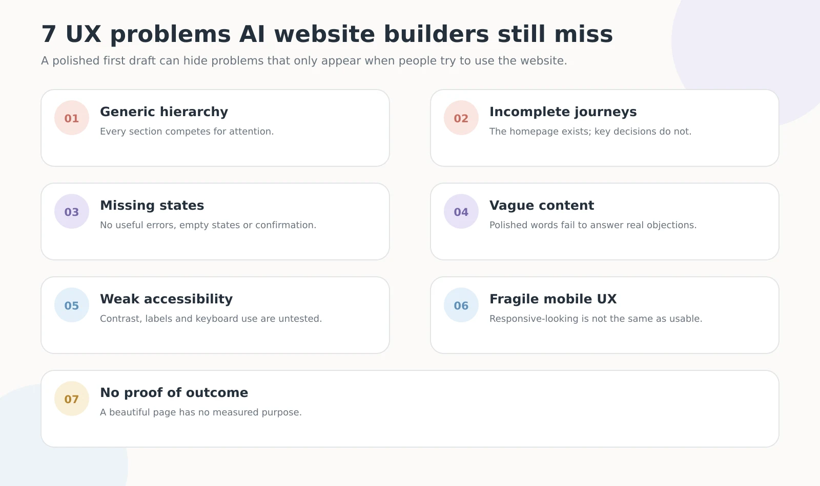
1. The hierarchy looks polished but everything competes
AI builders are good at producing familiar hero sections, feature cards, testimonials and calls to action. The problem begins when every section is given similar visual importance. Visitors see a professional page but cannot tell what matters first.
A strong hierarchy makes the primary offer, supporting proof and next action easy to scan. That requires deciding what a customer needs at each stage—not simply generating more attractive sections.
2. The homepage exists, but the customer journey is incomplete
A generated homepage may look finished while leaving important questions unanswered. What happens before someone contacts the business? Which service fits their situation? What information do they need to prepare? What happens after they submit the form?
UX design connects pages and actions into one journey. A beautiful homepage cannot compensate for confusing service pages, vague navigation or a contact process that creates uncertainty.
3. Error, empty, loading and confirmation states are missing
Generated demonstrations usually show the ideal state: the form is complete, the content exists and nothing fails. Real websites also need to explain incorrect input, unavailable results, slow loading, failed payments and successful submissions.
These states affect trust because they appear when users are already uncertain. A clear confirmation message can be as important as the original call to action.
4. The copy sounds professional but does not answer real objections
AI can create fluent copy, but fluent does not mean specific. Phrases such as “tailored solutions,” “seamless experiences” and “take your business to the next level” can fit almost any company.
Useful website content explains who the service is for, what problem it solves, how the process works, what makes the approach different and what the customer should do next. Those answers come from business knowledge and customer research—not visual polish.
5. Accessibility is treated as appearance instead of behaviour
A page can look accessible while still having unlabelled form fields, weak keyboard focus, unclear button names or controls that depend on colour alone. The W3C recommends that form controls have properly associated labels, helping people understand what information each field requires. See W3C form-label guidance.
AI can assist with accessibility checks, but the complete experience still needs testing with a keyboard, screen reader considerations, real content and different zoom levels.
6. Mobile is responsive-looking, not necessarily usable
An AI builder may stack desktop sections into a mobile layout without checking whether the result is comfortable to use. Long headings can dominate the screen, floating elements can cover content, tap targets may be too close, and animations that feel smooth on desktop may delay interaction on a phone.
Mobile UX should be tested as a real task: find the service, compare options, open the menu, complete the form and confirm success. A responsive screenshot is only the beginning.
7. The design has no defined outcome
“Make it modern” is a visual request, not a business goal. Without a defined outcome, AI can produce a convincing page that has no clear way to judge success.
Before generating anything, decide what the page should help a visitor accomplish. That may be understanding a complex service, choosing between options, requesting a quote or booking a consultation. The design can then be tested against that outcome.
Which AI design tool is best in 2026?
There is no universal winner because the tools solve different parts of the workflow. The ratings below are editorial judgments about how useful each tool is as a professional starting point; they are not laboratory benchmarks.
| Tool | Best use | Practical rating | Why |
|---|---|---|---|
| Figma Make | Interactive prototypes and websites | ★★★★★ | Strong when designers need to generate, inspect and refine layout and behaviour together. |
| Google Stitch | Fast UI exploration and front-end code | ★★★★☆ | Useful for moving quickly from a text or image prompt into an editable direction. |
| Relume | Sitemaps, wireframes and multi-page planning | ★★★★★ | Particularly useful before visual design because it starts with structure and page relationships. |
| Framer AI | Editable website creation and publishing | ★★★★☆ | A fast path from prompt to responsive site, with continued control on the design canvas. |
Figma’s 2026 design agent now works across flows, states, copy and structure, while Framer’s 2026 Agents release brings AI directly into the site canvas for design, writing and organization. These advances reduce production time, but they also make the quality of the brief, research and review process more important.
A real example: using AI-assisted structure without accepting the first draft
For the Cybertivity website UX/UI project, I used Relume wireframe components to accelerate the early structure, then designed the complete visual experience in Figma for Webflow implementation.
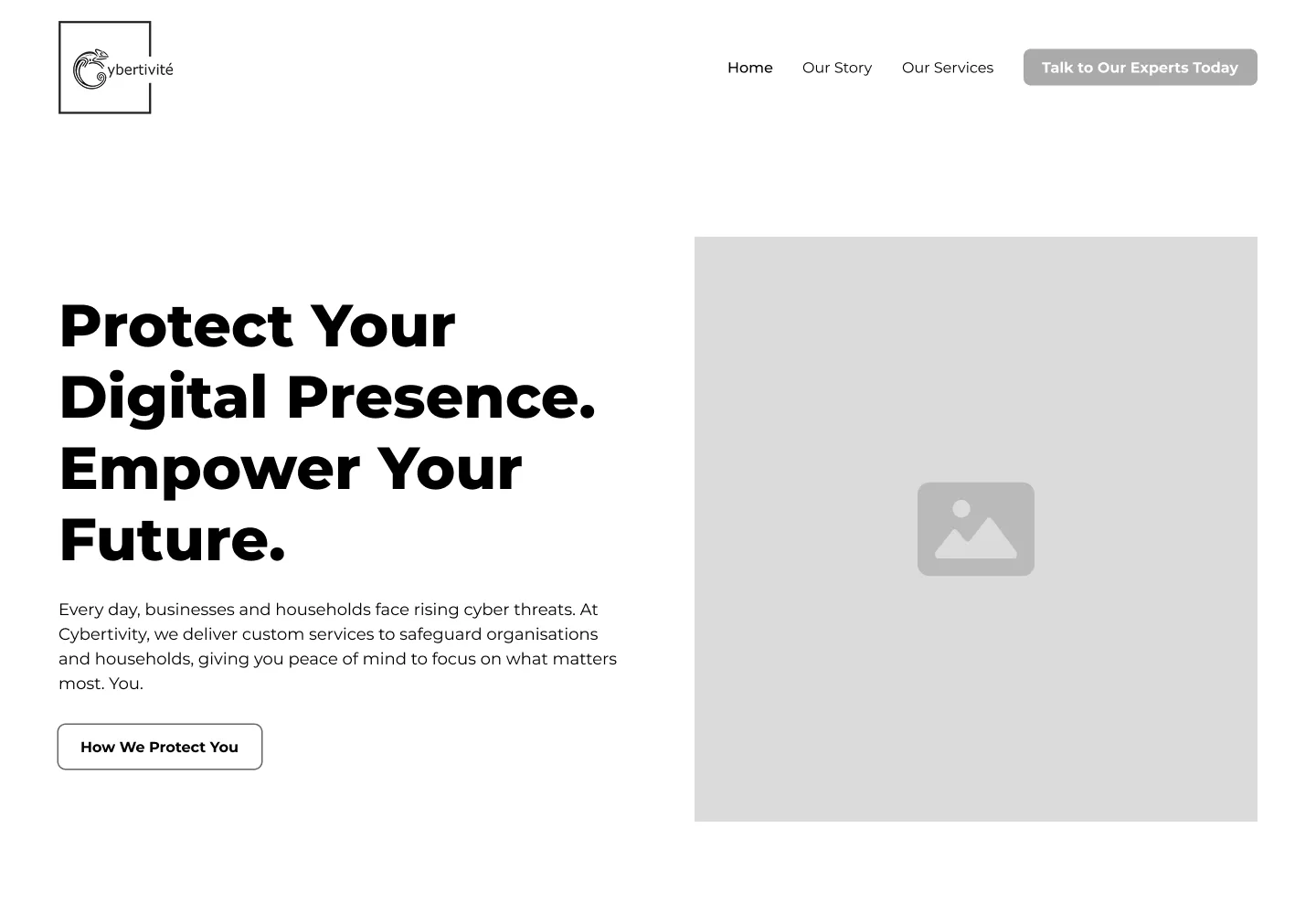
Before: the wireframe established the page structure and content flow.
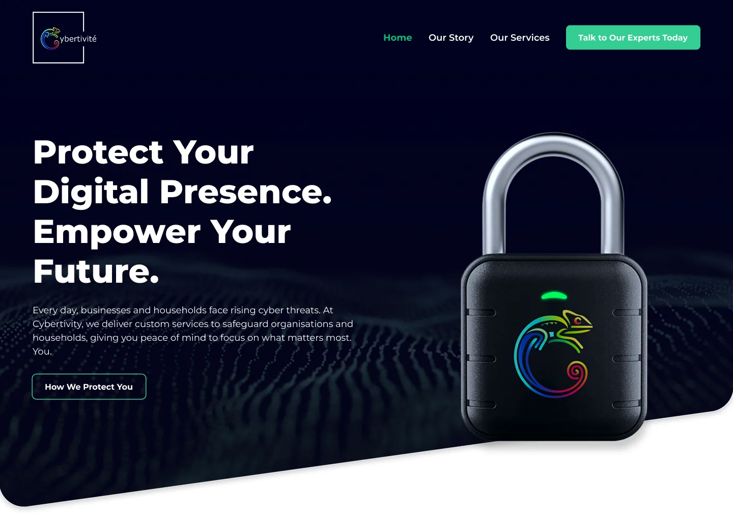
After: the Figma prototype turned that structure into a specific, high-contrast visual system for a cybersecurity consulting company.
The final project covered three pages—Home, Our Story and Our Services—plus desktop and mobile layouts. The value was not simply making one screen look better. It was creating a cohesive system across the full website, maintaining hierarchy, navigation, branding and responsive behaviour.
This is the useful role of AI and component libraries: remove unnecessary blank-canvas work, then give the designer more time to make decisions that fit the audience and business.
Use this UX scorecard before publishing an AI-generated website
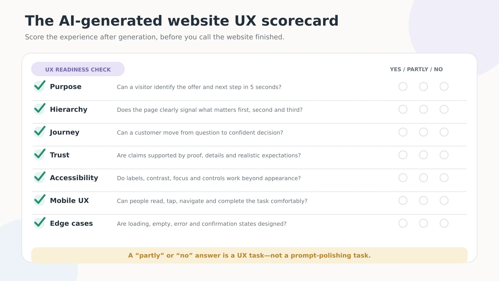
Review the website using seven questions:
- Purpose: Can a visitor identify the offer and next step within five seconds?
- Hierarchy: Does the page make the first, second and third priorities obvious?
- Journey: Can a customer move from a question to a confident decision?
- Trust: Are important claims supported by proof, details and realistic expectations?
- Accessibility: Do labels, contrast, focus states and controls work beyond appearance?
- Mobile UX: Can people read, navigate and complete the task comfortably on a phone?
- Edge cases: Are loading, empty, error and confirmation states designed?
If several answers are “partly” or “no,” the solution is not another prompt asking the AI to make the page more modern. The project needs UX work.
A practical workflow that keeps AI fast and UX human-centred
Start with context, not a style prompt
Define the audience, primary task, business goal, required content, brand constraints and known customer concerns. Give the tool examples of what good looks like and explain what it must avoid.
Generate structure before decoration
Create the sitemap, content priorities and main journey before choosing visual effects. This makes it easier to find missing pages and unanswered questions while changes are still inexpensive.
Test realistic tasks
Ask someone unfamiliar with the project to find a service, explain the difference between two options, locate proof and complete the main action without assistance. Record where they hesitate.
Refine the full system
Review headings, buttons, forms, navigation, mobile behaviour, accessibility and edge cases as one connected experience. A local improvement should not create inconsistency elsewhere.
Watch: why AI-era designers should focus on outcomes
Nielsen Norman Group’s short video, Outcome-Oriented Design: The Era of AI Design, explains why designers are moving beyond individual screens and focusing more directly on user goals and final outcomes.
Use AI for speed and UX for results
AI website builders are already good enough to change how websites are planned, designed and built. They are excellent for exploration, first drafts, repeated components and production acceleration.
They still do not remove the need for UX judgment. The strongest websites in 2026 will combine AI speed with customer understanding, clear content, accessibility, complete journeys and careful testing. The goal is not to prove that a human can place every button better than AI. The goal is to make sure the finished experience solves the right problem.
If your generated website looks polished but still feels generic, confusing or difficult to trust, a focused UX/UI design review can identify what the first draft missed.
Need help improving your website experience?
I help businesses create clearer, more usable digital experiences through UX/UI design and practical website improvements. Tell me about your project.