
Beautiful websites are everywhere. The websites that win attention and convert visitors in 2026 do something more: they make the next step clear, fast and easy. That is the real value of strong UX/UI design.
This guide looks beyond visual fashion. These UX/UI design trends for 2026 can help service businesses, online stores and personal brands reduce friction, build trust and turn more visits into enquiries or sales.
What makes a UX/UI trend worth using in 2026?
A useful trend should solve a user problem. It should improve clarity, accessibility, speed or confidence—not decorate a confusing journey. Before adding a new effect or AI feature, ask three questions:
- Does it help visitors understand what to do next?
- Does it make the experience faster or easier on mobile?
- Can we measure whether it improves completion, enquiries or sales?
If the answer is no, it may be a visual fashion—not a conversion improvement.
1. AI assistance with clear human control
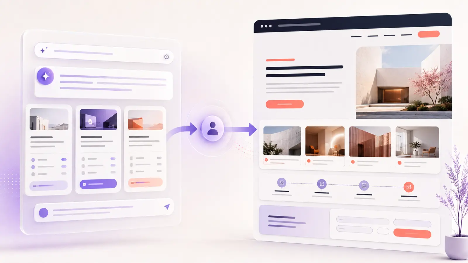
AI is becoming part of the interface, but the strongest experiences do not place a chatbot on every page. They use AI for a specific job: helping a visitor compare options, summarize information, complete a form or find the right service.
The conversion opportunity is convenience. The risk is uncertainty. Visitors should always understand what the AI can do, what information it uses and how to continue without it. Keep a visible manual path, allow users to review generated answers and never hide an important decision behind automation.
Practical example: A design agency can use a short guided assistant to help a visitor choose between branding, UX/UI and WordPress support, then show the matching service and a normal contact option.
2. Fast feedback becomes part of the design
Speed is not only a development concern. It changes how the interface feels. When a menu, filter, form or cart appears to ignore a click, people may click again, abandon the task or assume the website is broken.
Google’s Interaction to Next Paint guidance describes INP as a measure of overall responsiveness. A good target is 200 milliseconds or less. Designers can support that goal by reducing unnecessary interactions, avoiding heavy animation before a result appears and showing immediate feedback after a click.
- Change a button state immediately after it is pressed.
- Show progress when an action needs more time.
- Keep menus and filters light enough to respond quickly.
- Reserve space for images and results to prevent layout jumps.
3. Accessibility is built into the first design
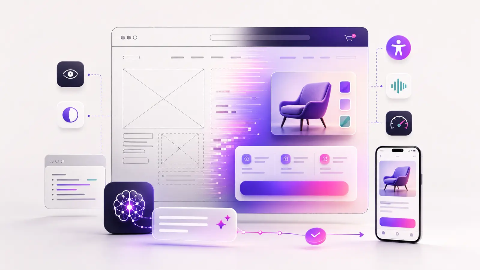
Accessible design is moving from a final checklist to a starting point. Clear contrast, visible keyboard focus, readable type and comfortable touch targets help more people use a website—and usually make the journey easier for everyone.
For example, WCAG 2.2 guidance on target size sets a 24 by 24 CSS pixel minimum in many situations, with specific exceptions. In practice, important buttons often benefit from being larger, with generous spacing that reduces accidental taps.
Accessibility also supports conversions. A form label that remains visible is easier to understand than placeholder text that disappears. A strong focus indicator helps keyboard users complete checkout. A clear error message tells people how to fix a problem instead of forcing them to start over.
4. Calm interfaces replace visual overload
Minimalism is not new, but in 2026 it is becoming more purposeful. The goal is not to remove personality. It is to create a clear visual hierarchy so the most important information arrives at the right moment.
This approach is often called progressive disclosure: show the essential choice first, then reveal details when they are useful. It works well for pricing tables, service packages, product filters and long forms. Instead of presenting every feature at once, lead with the decision a visitor needs to make.
A conversion-focused page normally needs one primary action per section. Secondary actions can remain available, but they should not compete with the main call to action.
5. Responsive design becomes component-based
Designing one desktop screen and shrinking it for mobile is no longer enough. Modern websites are assembled from reusable components—cards, navigation, forms, testimonials and calls to action—that must work across different containers and screen sizes.
For users, the benefit is consistency. A familiar button behaves the same way across the site. A product card keeps its most important information visible whether it appears in a wide grid, a narrow sidebar or a mobile screen. For businesses, a component system also makes future updates faster and less expensive.
If you are planning a redesign, review real mobile content early. Long service names, translated text, validation errors and large accessibility settings expose problems that perfect sample content can hide.
6. Trust-first design improves conversion quality
Visitors are more careful about privacy, AI-generated information and online purchases. Trust signals should appear where uncertainty happens—not only in the footer.
- Place delivery, return or cancellation information near the decision.
- Explain why a form asks for personal information.
- Use real testimonials with useful context.
- Show the next step after a form is submitted.
- Keep privacy and policy pages easy to find.
For ecommerce websites, trustworthy forms and clear policies are part of the user experience. See these three free forms for a secure online store for a practical example.
7. Motion explains change instead of distracting from it
Micro-interactions can make an interface easier to understand. A short transition can show that a filter changed the results, a file finished uploading or an item was added to a cart. The motion has a job.
Avoid long entrance animations that delay content, autoplay effects that compete for attention and motion that ignores a user’s reduced-motion preference. The best animation is brief, responsive and optional when possible.
How to apply these UX/UI design trends
Do not redesign everything because a trend looks modern. Start with the page that matters most to the business, such as a service page, product page or contact form.
- Choose one conversion goal. Decide whether the page should generate an enquiry, booking, signup or sale.
- Find the friction. Review analytics, Search Console, form errors and common customer questions.
- Make one meaningful change. Improve the hierarchy, mobile interaction, trust information or response feedback.
- Measure the result. Compare completion rate, qualified enquiries and user behaviour—not only clicks.
- Keep what works. A successful design system grows from tested decisions.
The best 2026 interfaces will feel simple
The strongest UX/UI design trends in 2026 share one idea: technology should reduce effort. AI should assist without taking control. Motion should explain. Accessibility should be part of the design. Performance should be felt in every interaction.
A website does not need every new effect. It needs the right structure, content and visual direction for its users. If your current website looks modern but is not generating enough enquiries, review my design portfolio or contact me to discuss a conversion-focused UX/UI improvement.