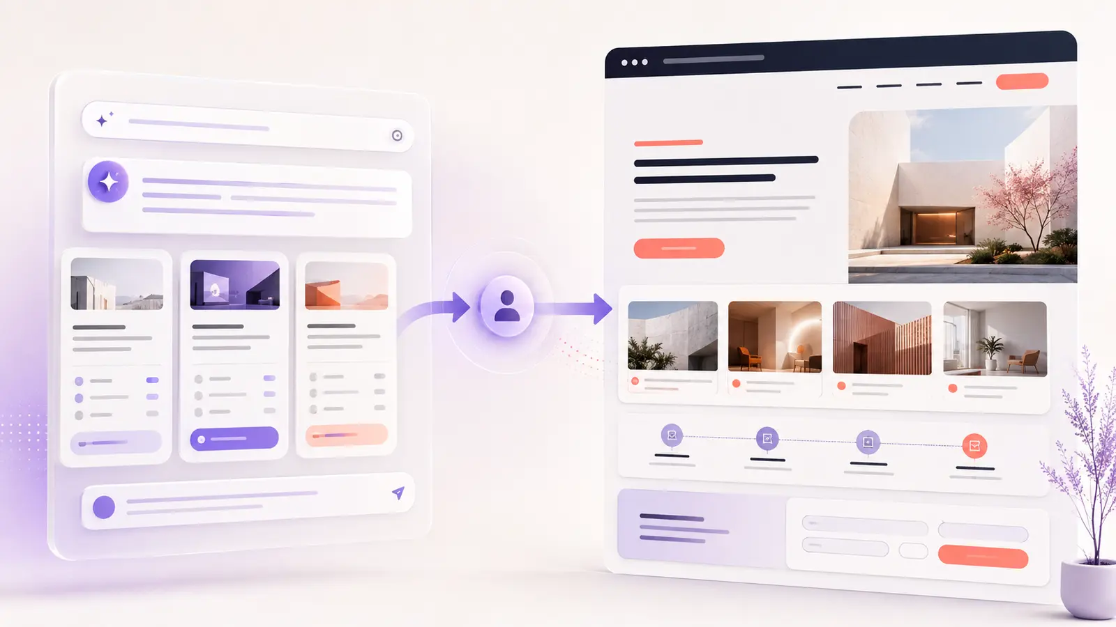

AI search is not making landing pages less important. It is changing the condition in which people arrive.
A visitor coming from ChatGPT, Copilot, Perplexity or a Google AI answer may already have described a detailed need, compared several options and ruled out poor matches. The landing page is no longer responsible for starting the entire conversation. Its job is to confirm relevance, make the evidence easy to verify and provide a clear next step.
That changes landing page UX in 2026: less generic persuasion, more precise confirmation.
AI search is changing the click before it changes the page
AI-assisted discovery is already part of normal search behaviour. In a February 2026 survey, Pew Research Center found that 60% of U.S. adults had read AI summaries at the top of search results.
These summaries can also reduce the number of visits websites receive. Pew’s earlier browsing study found that people clicked a traditional result in 8% of Google visits that included an AI summary, compared with 15% of visits without one. Only 1% clicked a link inside the summary itself.
Fewer clicks do not necessarily mean weaker visitors. Microsoft Clarity reported in April 2026 that AI-referred traffic had grown 22% over the previous six months. Its session data also showed that these visitors engaged more deeply, viewed fewer pages and abandoned less often than visitors from traditional channels. Clarity’s earlier study found that AI-referred traffic converted at three times the rate of other channels.
The pattern is important: AI may answer routine questions before the click, then send a smaller group of people who have a more specific reason to visit.
This article continues the customer journey covered in how customers find businesses through search, social and AI. That article explains where discovery happens. This one focuses on the landing experience after AI search sends someone to a website.
Traditional search visitors and AI-referred visitors may arrive differently
| Journey signal | Traditional search visit | AI-referred visit |
|---|---|---|
| Starting point | A short keyword or broad question | A detailed prompt with needs and constraints |
| Before the click | The visitor scans titles and snippets | The AI may summarize, compare and narrow options |
| Likely entry page | Homepage, article or service page | Often a specific deep page cited in an answer |
| Main need on arrival | Understand the category and available options | Confirm that the recommendation is accurate |
| Decision pattern | May browse several pages | May evaluate one page and act quickly |
Not every AI visitor behaves this way, and traditional search remains important. The useful design assumption is narrower: some landing-page visitors now arrive with more context than the page can see.
Seven landing page UX changes that matter in 2026
1. Confirm the reason for the click immediately
The hero should help a visitor verify three things without interpreting vague marketing language:
- What the business provides
- Who the service or product is for
- What outcome the page supports
A heading such as “Digital solutions for modern businesses” says very little. A clearer version names the work, audience or result. The visitor should not have to reverse-engineer the offer after an AI tool has already presented it as a match.
2. Put proof beside the claim it supports
AI can summarize claims, but the website must make them credible. Place relevant proof close to the message instead of collecting every testimonial and logo near the bottom.
Useful proof can include:
- A portfolio example that matches the service
- A before-and-after comparison
- A specific result with enough context to understand it
- A named client review
- A screenshot, process document or original demonstration
For example, the Best Auto Body landing page case study is stronger evidence for landing-page design than a general claim about creating conversion-focused experiences.
3. Answer the criteria people use to compare options
People often ask AI tools to compare providers by location, industry experience, platform, scope, timing, budget or working process. If those details are relevant and known, the landing page should not hide them behind a contact form.
This does not require a dense FAQ or a long sales page. A short process, realistic scope notes, service area, expected timeline and pricing approach can remove major uncertainty. When exact prices depend on the project, explain what affects the estimate and what a client receives next.
4. Design a shorter decision path
High-intent visitors do not always need more content. They need the right content in a useful order:
- Confirm the offer.
- Check evidence.
- Understand the process or terms.
- Take one clear action.
Multiple competing buttons can interrupt that path. Keep one primary action consistent, such as requesting a quote, booking a call or starting an inquiry. Secondary links should support evaluation rather than compete with the main goal.
5. Make deep landing pages understandable on their own
AI assistants may cite a case study, service page, guide or comparison instead of the homepage. Each important entry page therefore needs enough context to stand independently.
A deep page should identify the business, explain the page’s purpose, provide a route to related proof and make the next step visible. Clear navigation still matters, but it should not be the only way a visitor can understand where they landed.
6. Replace generic reassurance with transparent detail
Words such as “professional,” “innovative” and “results-driven” are easy for any business—or AI writing tool—to produce. They do not help someone verify fit.
Concrete details are more useful: deliverables, tools, stages, responsibilities, review points, limitations and examples of completed work. Transparency helps a visitor compare the AI answer with the real service instead of trusting the summary blindly.
7. Keep forms easy for people and browser agents to understand
A strong landing page can still lose a qualified visitor at the final step. Forms need visible labels, clear required fields, helpful error messages and an unmistakable success confirmation. Buttons should describe the action instead of using labels such as “Submit” without context.
These choices also make interfaces easier for assistive technology and emerging browser agents to interpret. The goal is not to build a separate experience for machines. It is to remove ambiguity from the existing human experience.
What not to do for AI search
Landing-page UX should not become a collection of speculative “GEO” tricks. Google’s current guidance for generative AI search says established SEO practices still apply and recommends original, useful, people-first content.
Google also states that website owners do not need to:
- Create an
llms.txtfile for Google AI visibility - Break every page into tiny content fragments
- Rewrite pages in a special style for AI systems
- Add special structured data solely for generative AI search
- Publish many near-duplicate pages for prompt variations
For landing pages, those tactics can create a worse experience: repetitive copy, artificial headings, excessive cards and content written for an imagined crawler rather than a real decision.
A practical AI-search landing page audit
Open an important landing page directly—without first visiting the homepage—and check the following:
- Relevance: Can a visitor identify the offer, audience and outcome within a few seconds?
- Verification: Is meaningful proof placed close to the claims it supports?
- Comparison: Does the page answer the main criteria people use to evaluate alternatives?
- Context: Does the page make sense as a first entry point?
- Direction: Is there one obvious next action?
- Transparency: Are the process, scope and important limitations clear?
- Completion: Can the visitor use the form comfortably on mobile and understand whether it succeeded?
If several answers are “no,” adding more traffic will not solve the problem. The landing experience needs clearer decisions.
Measure qualified actions, not AI traffic alone
AI referrals may still represent a small share of total sessions, so raw traffic can be misleading. Microsoft Clarity recommends tracking AI referral conversions: meaningful actions completed by visitors who arrive from AI assistants.
For a service landing page, review:
- Which AI source sent the visit
- Which page the visitor entered
- Whether the visitor reached a portfolio or proof section
- Contact-form starts and completions
- Qualified inquiries, not only form volume
- Mobile abandonment and form errors
Compare these signals with traditional organic search over a useful period. Do not redesign a page after a handful of sessions, but do look for repeated friction: visitors arriving on the right page and leaving before they can verify the offer or complete the action.
The landing page becomes the verification layer
AI search can summarize a business, compare providers and answer initial questions. It cannot replace the business’s responsibility to present accurate information and a credible experience.
In 2026, a strong landing page should do three things well: confirm the recommendation, prove the claim and make the next step easy. That is good UX for AI-referred visitors, traditional search visitors and anyone who arrives through a direct link.
If a landing page attracts interest but does not give visitors enough clarity or confidence to act, a focused UX/UI design review can identify where the journey breaks.
Need a clearer landing-page journey?
I design and review landing pages for businesses that need clearer messaging, stronger proof and a more usable path to inquiry. Tell me about the page and the result it needs to support.