Figma’s AI Design Agent produced a polished desktop and mobile website concept from a single detailed prompt. Visually, the result was coherent and surprisingly specific to the fictional Montréal business I described.
But a finished-looking screen is not the same as a finished website design. The bilingual interface did not actually switch languages, no buttons or navigation worked, the file contained no reusable components, and several content and accessibility details still needed review.
My conclusion from this test is simple: Figma’s Agent can produce a strong starting point, but it still needs a designer to verify behaviour, language, facts and usability.
This was a test of the native Agent inside a Figma Design file—not Figma Make. Figma’s Help Center distinguishes the two: the Design Agent works directly with design files, while Figma Make is intended for generating interactive apps and prototypes.
What I asked Figma’s Agent to design
I wanted a test that went beyond requesting a generic landing page. A bilingual Montréal website adds real UX questions: language parity, longer French copy, responsive spacing and a language control that users can understand.
To avoid using client information, I created a fictional independent bakery called Atelier Levain. This was the prompt:
Design a responsive bilingual homepage in English and French for a fictional independent Montréal bakery called Atelier Levain. It offers sourdough bread, pastries, pre-orders and neighbourhood pickup. Create one desktop homepage at 1440px and one mobile version at 390px. Include a clear EN/FR language switcher, hero, featured products, short brand story, opening hours and Montréal location, customer review, FAQ and pre-order CTA. Write real English and French copy with equal content—no lorem ipsum. Leave enough space for longer French text. Use a warm, modern editorial style with accessible contrast, clear hierarchy and reusable components. Avoid flags, maple leaves, skyline clichés and generic corporate visuals. Make it feel specific to a real Montréal small business rather than a template.
I submitted the prompt without supplying an existing design system or component library. This matters because Figma says the Agent can work with connected components, tokens and variables when that context is available.
The first draft looked finished faster than expected
The Agent returned two editable frames:
- Desktop: 1440 × 5291 pixels
- Mobile: 390 × 5717 pixels
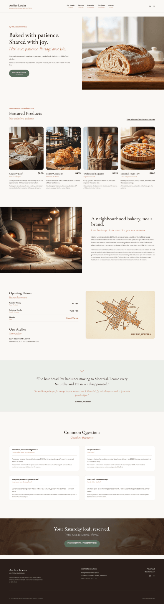
The desktop version included every major section I requested: hero, featured products, bakery story, opening hours, location, testimonial, FAQ, preorder banner and footer. The warm photography, serif typography and restrained colours created a consistent visual direction that felt appropriate for a small Mile End bakery.
The mobile version was not simply a compressed copy of the desktop frame. Content was reorganized into a deliberate single-column sequence, images were resized appropriately and product cards became easier to scan vertically.
That first impression was strong. It also made the problems less obvious because the design already looked presentable from a distance.
What Figma’s Agent got right
The strongest part of the result was its layout work.
The hierarchy remained clear across both screen sizes. The hero had a focused message and CTA, the product section was easy to identify, and the long page was divided into visually distinct sections. French copy generally had enough room and did not visibly clip.
The file inspection also found substantial use of auto layout: 92 auto-layout nodes in the desktop frame and 76 in mobile. That gave the generated design more usable structure than a flat mockup made from loosely positioned layers.
The local character was handled with restraint. Instead of obvious maple leaves or skyline graphics, the Agent used bakery imagery, Mile End references and a simple neighbourhood map. One prompt cannot prove that the same quality will appear in every project, but this result showed that a detailed brief can reduce the generic AI-template look.
What looked bilingual but did not behave bilingually
The design included EN and FR labels in the header, but they only looked like a language switcher. English and French were displayed together throughout the page, and the switcher had no working behaviour.
This created two problems. First, the interface did not represent how a visitor would actually choose and use one language. Second, repeating both languages made the mobile page considerably longer. Its final height reached 5717 pixels partly because nearly every English message was followed by its French equivalent.

File inspection found zero prototype reactions across both frames. The navigation, hamburger menu, language control and preorder CTAs were all static. Figma’s current Help Center lists prototyping and interactions as “coming soon” for the Agent, so this limitation is important when judging the result fairly.
A real bilingual interface needs more than translated lines. It needs clear language states, content parity, navigation decisions and responsive checks in each language. My bilingual Montréal website work for Melkart Group is a practical example of why language behaviour and page structure must be considered together.
The file was editable, but it was not a reusable system
Auto layout made the frames easier to edit, but the Agent created zero components, component sets or instances—even though the prompt explicitly requested reusable components.
The product cards, buttons, FAQ cards and repeated headings looked consistent, but each remained an independent group of layers. Changing a shared button style or product-card structure would therefore require repeated manual edits.
This distinction matters in professional Figma work. A visually repeated element is not automatically a reusable component. Figma promotes the Agent’s ability to work with real components, variables and design libraries, so a future test with a connected library could produce a different result. In this blank-file test, however, the first output was a structured concept rather than a maintainable design system.
Small details still required human review
The visual polish did not remove the need for detailed QA.
One French line read “À d’éguster” instead of “À déguster,” and some other phrases sounded translated rather than naturally written for a Montréal audience.
The Agent also invented a complete street address, a customer testimonial and a time-sensitive statement about neighbourhood delivery in 2026. Realistic filler can help a mockup feel credible, but invented details must be clearly marked and replaced before client review or publication. A fabricated testimonial or service promise can create a serious credibility problem if it is mistaken for approved content.
Accessibility also needed attention. The coral text colour #B55A43 against the off-white background #FAF8F5 measured 4.39:1. That is slightly below the WCAG AA minimum of 4.5:1 for normal-sized text, and several coral labels were small.
These are exactly the kinds of issues that can be missed when an AI-generated screen looks finished. I have written separately about the broader UX problems AI website builders can introduce; this test adds specific evidence from Figma’s native Design Agent rather than repeating that broader list.
The beta limit stopped a same-day revision
During this September 1, 2026 test, after the first generation, the Starter test account displayed this message:
“You’re out of daily credits for this beta feature in your free Starter plan. Upgrade your plan to keep prompting today.”
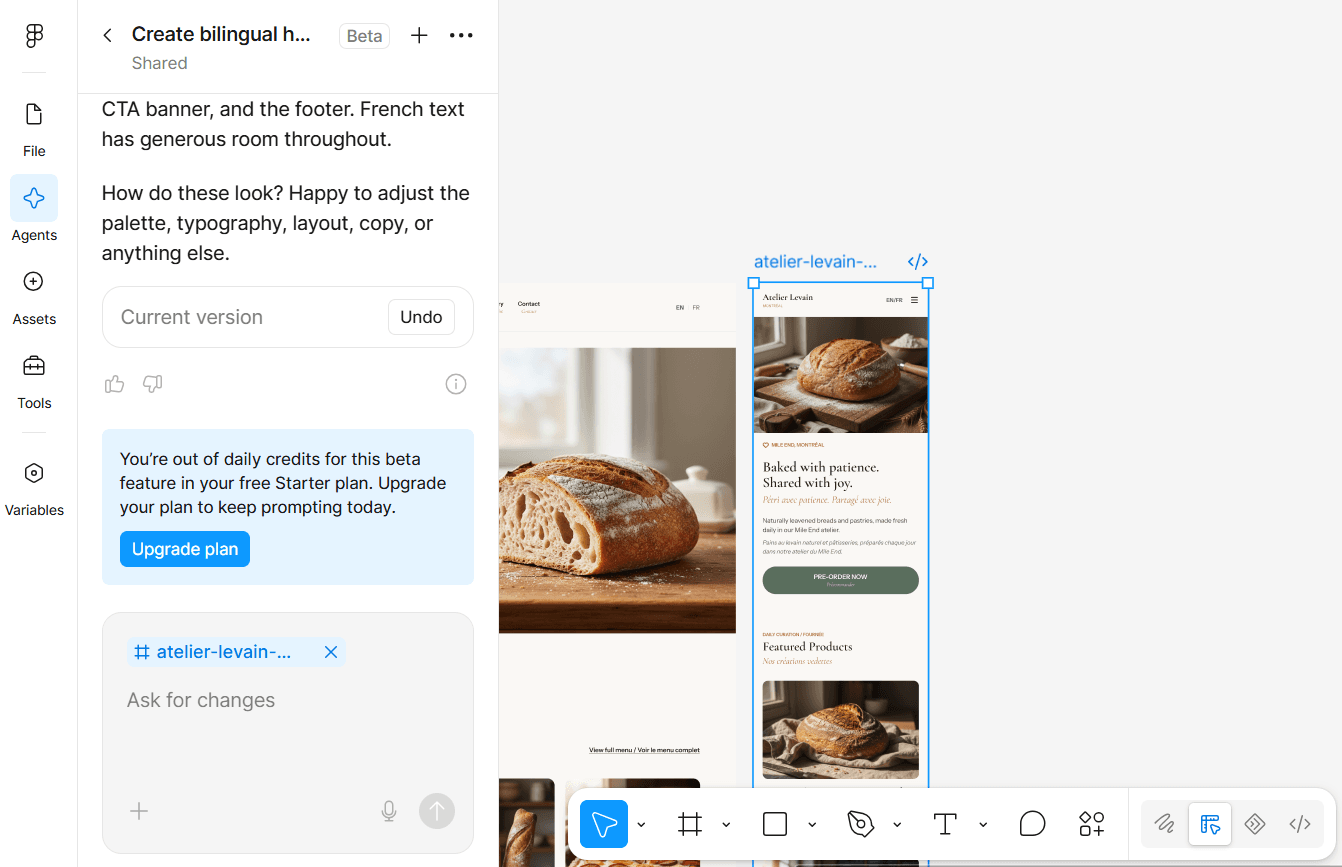
That prevented me from running a same-day revision prompt.
I would not treat this as a universal statement about Figma’s pricing. Figma’s AI Design Agent page currently says the open beta is available on paid plans and does not consume AI credits. Its Help Center says credit use can vary with task complexity and separately describes monthly beta limits. The account interface, however, displayed a daily-credit message during this September 1 test.
The public documentation and the message observed in the account do not use the same limit wording. Plan eligibility, credit rules and beta limits may change, so anyone testing the feature should check Figma’s current Agent documentation rather than assuming this account’s limit applies to everyone.
Where the Agent was useful—and where a designer remained necessary
Based on this test, I would use Figma’s Agent for:
- producing an initial visual direction from a detailed brief;
- setting up desktop and mobile starting frames;
- creating a first content hierarchy;
- testing layout ideas before manual refinement;
- reducing repetitive setup work.
I would not rely on the first output for:
- bilingual information architecture;
- approved French copy;
- factual business content;
- reusable component systems;
- accessible colour decisions;
- working navigation or prototype behaviour;
- final client delivery.
The value of the designer shifts from placing every first-draft layer manually to asking better questions, checking assumptions and turning generated material into a usable system. That judgement is also central to building a sustainable UX/UI career while AI tools change the workflow.
Would I use Figma’s AI Design Agent again?
Yes—as a starting point.
The Agent created a credible visual concept and intentionally adapted it for mobile. It also showed how easily a polished surface can hide unresolved language, interaction, system and accessibility problems.
One test cannot define the tool’s performance in every context. It does show that speed and visual quality should not be confused with readiness. The best result came from treating the Agent as a fast design collaborator whose output still required professional review.
If you are planning a bilingual website and need help turning an early concept into a clear, usable interface, you can contact me about UX/UI design.