
A page is not mobile-ready because it looks acceptable inside Elementor’s phone preview.
Before I launch a WordPress website, I test the structure, spacing and interactions at several widths, then open the live page on a real phone. The editor helps me find responsive settings; the real device tells me whether the page actually feels usable.
This is the checklist I use to catch the problems that are easiest to miss: a container that becomes wider than the screen, a heading that wraps badly between breakpoints, a menu icon that is difficult to tap, a form hidden by the mobile keyboard, or an image crop that removes the important part of the visual.
1. I check the layout structure before adjusting spacing
When a mobile layout feels wrong, I start with the parent container. I do not begin by adding random margins to individual widgets.
In Elementor, I check:
- container direction: row, column or column-reverse;
- item order on the mobile breakpoint;
- wrap versus no-wrap;
- widget and child-container widths;
- justify and align settings;
- content gap;
- minimum height; and
- any custom positioning.
This order matters. A two-column section that should stack vertically will not become reliable because one widget received a negative margin. It may look fixed at 390 px and break again at 360 px.
Elementor’s responsive settings work from larger screens down to smaller ones. A tablet change can affect mobile, while a mobile-only change does not change tablet or desktop. I therefore review the inherited tablet values before overriding the phone layout. Elementor explains this behaviour in its responsive editing guide.
My rule: fix the parent layout first, then refine the padding, gap and typography.
2. I test the widths between Elementor’s presets
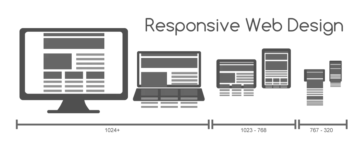
Desktop, tablet and mobile preview buttons are starting points—not a complete device test.
I drag through the full width range and pay special attention to 320 px, 375 px, 425 px and the area around the tablet breakpoint. The exact device name matters less than finding the width where the layout first starts to fail.
I look for:
- a card that suddenly becomes too narrow;
- two buttons that stop fitting on one row;
- a heading that creates an orphaned final word;
- filters that wrap into an awkward second line;
- a tablet layout that stacks too early or too late; and
- content that moves outside the viewport.
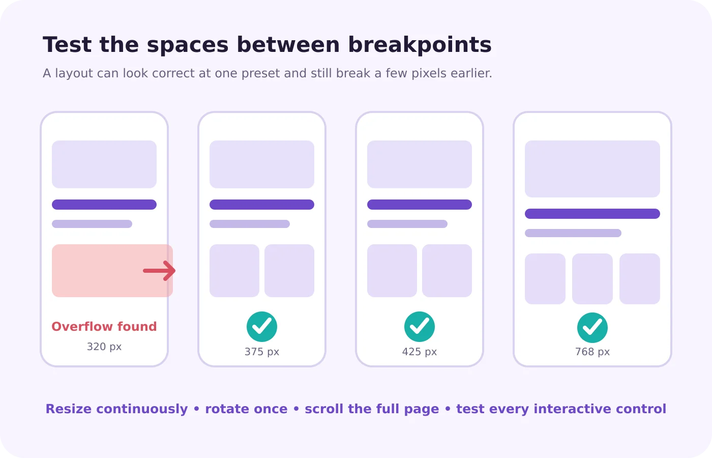
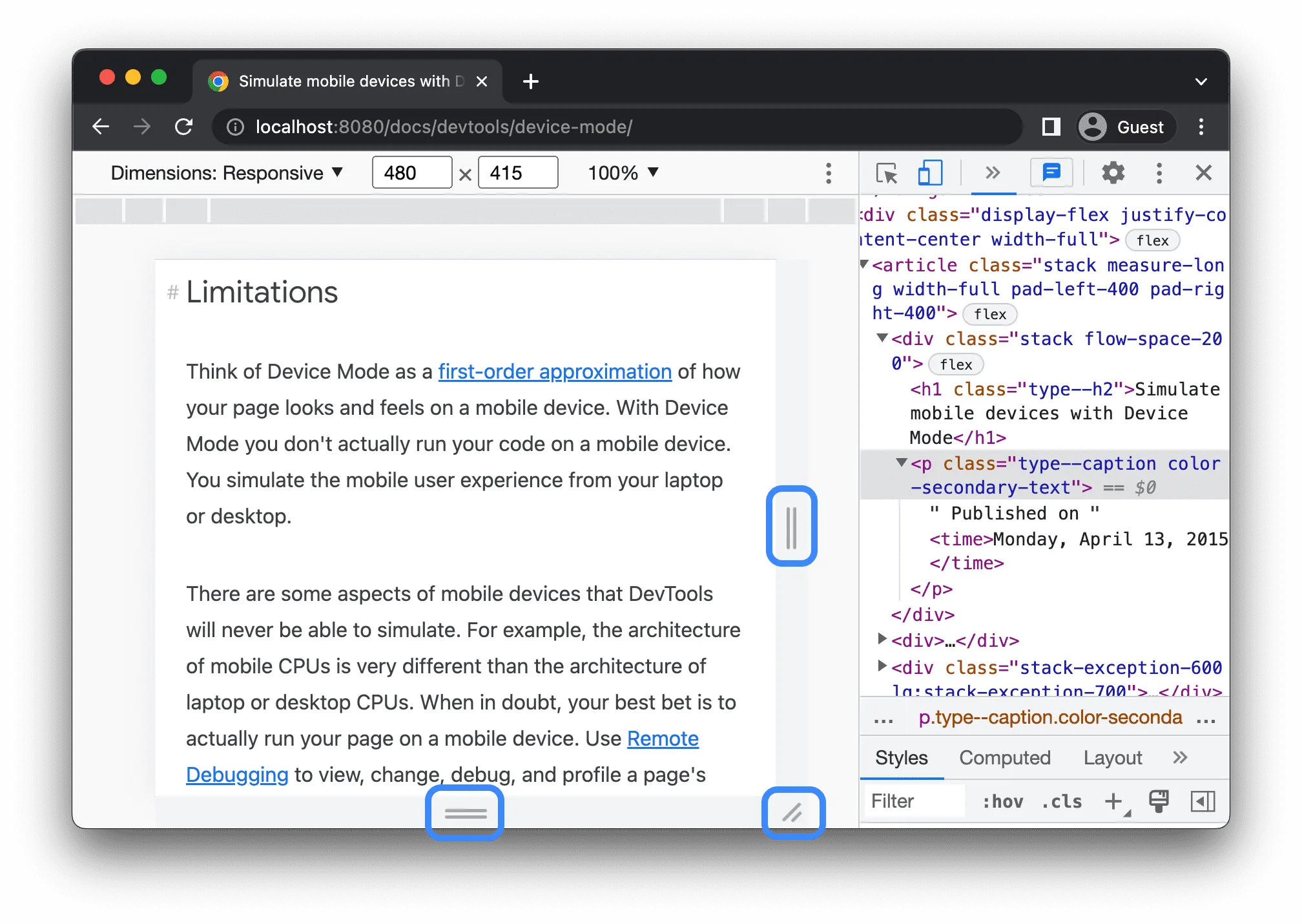
Chrome’s Device Mode lets me resize continuously, test preset widths, rotate the viewport and throttle the network. Google correctly describes it as an approximation, so I use it to find layout problems—not as a replacement for a real phone. See Chrome Device Mode.
3. I find the cause of horizontal overflow
My quickest check is simple: load the page on mobile and try to move it sideways. If the entire page slides left and right, something is wider than the viewport.
Common Elementor causes include:
- a top-level container with left or right margin;
- a widget with a fixed pixel width;
- a no-wrap row whose children no longer fit;
- an oversized image, SVG or Lottie canvas;
- a long URL or unbroken text string; and
- custom CSS using a width larger than
100%.
I do not use overflow: hidden as the first fix. It can hide the symptom while clipping content, focus indicators or controls. I identify the element causing the extra width and correct its sizing or layout.
There is one important exception: horizontal scrolling can be intentional. On the mobile filter row of the Zahra Ali blog, swiping through categories preserves a compact one-line control. That behaviour belongs to the filter itself. The whole page should not scroll sideways with it.
Elementor’s container documentation also warns that adding horizontal margin to a full-width top-level container can make the calculated width exceed the screen. Its container size and behaviour guide explains the cause.
4. I protect the hierarchy instead of shrinking everything
Mobile QA is not a contest to force the desktop design into a smaller rectangle.
I decide what the visitor needs to see first, then adjust the layout to support that order. A mobile hero normally needs a clear title, a short supporting sentence and one obvious primary action. Secondary details can move lower rather than competing for the first screen.
For typography, I check the result—not only the number entered in Elementor:
- Is the heading readable without dominating the entire screen?
- Does the line break still make sense at narrow and wide phone widths?
- Is the paragraph comfortable to read without zooming?
- Is there enough separation between the text and the next control?
- Are buttons easy to scan without their labels breaking badly?

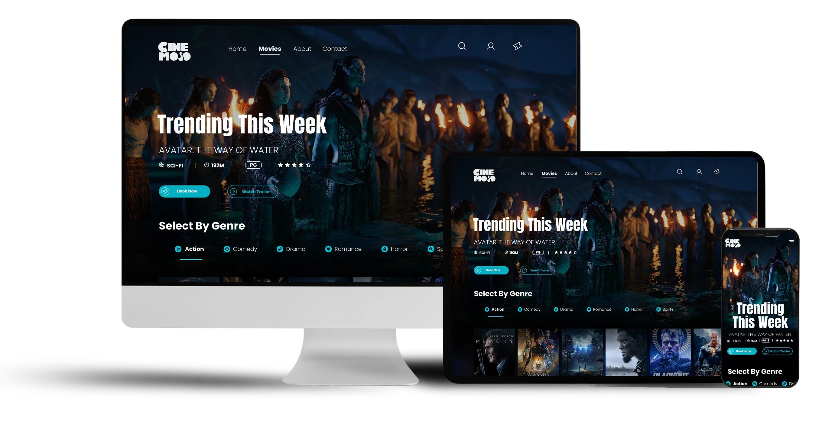
In my Cinemojo responsive website case study, the phone layout keeps the logo, menu, movie title and two main actions visible without reproducing the desktop navigation. The content is not merely smaller; its priority is clearer.
5. I inspect every important image crop
An image can have the correct width and still fail on mobile.
I check whether the subject remains visible after Elementor applies cover, whether the focal point needs a different mobile position, and whether text placed over the image still has enough contrast. I also check portfolio mockups, logos and screenshots for accidental cropping or empty space.
My image QA includes:
- the correct image selected at each breakpoint;
- a sensible aspect ratio for the container;
- intentional
object-positionor background position; - no stretching;
- width and height reserved to reduce layout shift;
- descriptive alt text; and
- an optimized file size and format.
For a large hero image, I confirm that performance settings have not made the most important visible image load too late. For the deeper performance pass, I use the workflow in How ChatGPT Can Help Make WordPress PageSpeed All Green.
6. I test buttons, menus, filters and forms with my thumb
A control can look large enough on a laptop and still be difficult to tap on a phone.
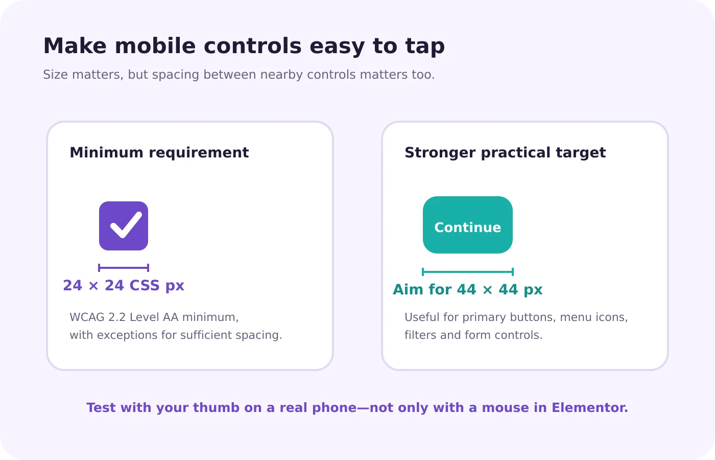
WCAG 2.2 Level AA sets a 24 × 24 CSS pixel minimum target size, with defined exceptions for spacing and certain types of controls. For important buttons, menu icons, filters and form controls, I usually aim for a more comfortable 44 × 44 px target when the design allows it.
I test:
- the mobile menu opens, closes and does not trap the page;
- the sticky header does not cover anchor targets;
- buttons have space between them;
- filter chips can be swiped and tapped;
- phone and email links perform the expected action;
- form fields use appropriate input types;
- the keyboard does not hide the active field or submit button;
- errors appear next to the correct field; and
- cookie controls remain usable without blocking the page.
I also submit one real test form. A form that looks correct but never delivers the message has not passed QA.
7. I test the live page, logged out, on a real phone
My final check happens outside the Elementor editor.
I open the public URL in a logged-out or private browser window, because cache behaviour, the WordPress admin bar and editor assets can make the signed-in view different from what visitors receive.
I then test:
- the top and bottom of the page;
- portrait and landscape orientation;
- menus, links, filters, sliders and forms;
- sticky and fixed elements;
- the cookie banner;
- image and font loading on a slower connection; and
- at least one second phone width when available.
I run Lighthouse as a final diagnostic for performance, accessibility, best practices and SEO. It is useful for finding issues, but a green score does not prove that every interaction works. Chrome’s Lighthouse overview makes the same distinction: failed audits are indicators that guide further work.
If a recent Elementor change does not appear on the public page, I check caching and generated CSS before rebuilding the section. I do not treat “Regenerate Files & Data” as a routine design step; I use it only when the evidence points to stale generated files.
What I refuse to use as a mobile “fix”
These shortcuts usually move the problem instead of solving it:
- hiding page-level overflow before finding the wide element;
- stacking negative margins until one viewport looks correct;
- shrinking text until it becomes difficult to read;
- duplicating entire desktop and mobile sections when a responsive order change would work; and
- hiding important content on mobile only because the layout was not planned for it.
A stable mobile layout should survive the space between presets, not only the exact screenshot used during design.
Useful tools and official resources
Elementor: Responsive editing for mobile and tablets — current breakpoint and device-specific editing guidance.
Chrome Device Mode — continuous viewport resizing, rotation and throttling.
Responsively App on GitHub — a free, open-source browser for viewing several device sizes together and capturing synchronized screenshots.
WCAG 2.2: Target Size (Minimum) — the accessibility requirement behind minimum target sizing and spacing.
Chrome Lighthouse — automated performance, accessibility, SEO and best-practice checks.
For a broader Elementor overview, the official Elementor Responsive 101 video demonstrates responsive menus, typography, visibility and column order.
Before I press Publish
My final pass is short:
- no page-level horizontal scroll;
- no clipped heading, image or focus indicator;
- content order makes sense without the desktop layout beside it;
- buttons and form controls are easy to tap;
- every mobile menu, filter and form works;
- important images load clearly and keep their focal point;
- the public, logged-out page has been checked on a real phone; and
- Lighthouse findings have been reviewed, not blindly chased.
That final phone test often takes less time than repairing a broken mobile experience after launch.
External image credits
chrome-devtools-device-mode.png— screenshot from Chrome for Developers: Device Mode, used unchanged under the Creative Commons Attribution 4.0 licence.responsive-web-design-across-devices.png— “Responsive Web Design for Desktop, Notebook, Tablet and Mobile Phone” by Muhammad Rafizeldi, sourced from Wikimedia Commons, used unchanged under the Creative Commons Attribution-ShareAlike 3.0 licence.
Need a second pair of eyes before launch?
Need a second pair of eyes before your Elementor website goes live? I provide responsive UX/UI design and WordPress review focused on real usability—not only the desktop layout. Send me the page you want reviewed and include the devices or problem areas you are concerned about.